MTA turnstile data: Python exploratory data analysis using pandas, matplotlib, and seaborn.
The repository for this project is here: https://github.com/Jack-Etheredge/MTA-Turnstile-Analysis
In this repository is a presentation summarizing the visualizations and findings as well as a Jupyter notebook containing the Python code.
I brought in this turnstile data from: http://web.mta.info/developers/turnstile.html.
This project required data cleaning in pandas and exploratory data analysis (EDA).
Matplotlib and seaborn were used for plotting.
I also performed basic time series analysis using the data.
Daylight savings occurred during this time, so I accounted for the shift in times before daylight savings time.
Some turnstiles reset their counts during the period observed, so the 4 hour window in which that reset occurred was dropped for further analysis.
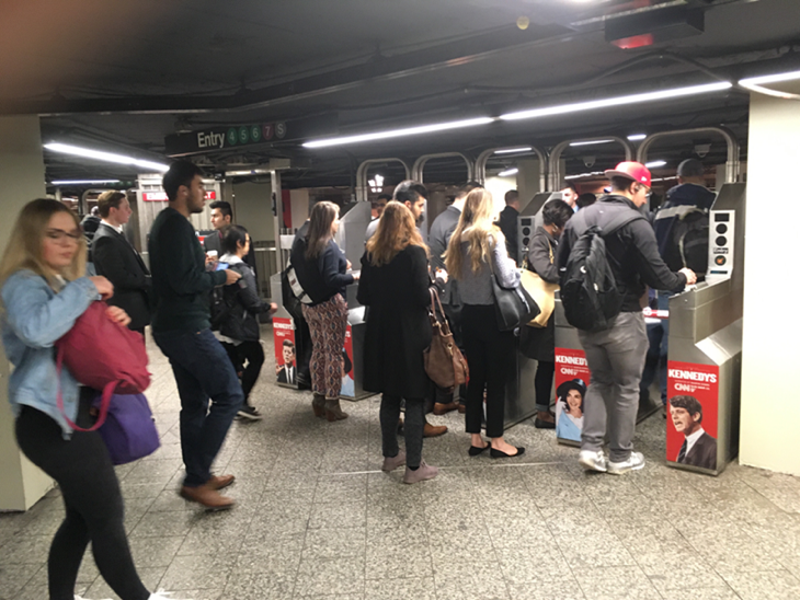
You can see many busy people going through the turnstiles. A collection of up to 14 turnstiles at an entry/exit point in a station is called a “control area” (“CA”).
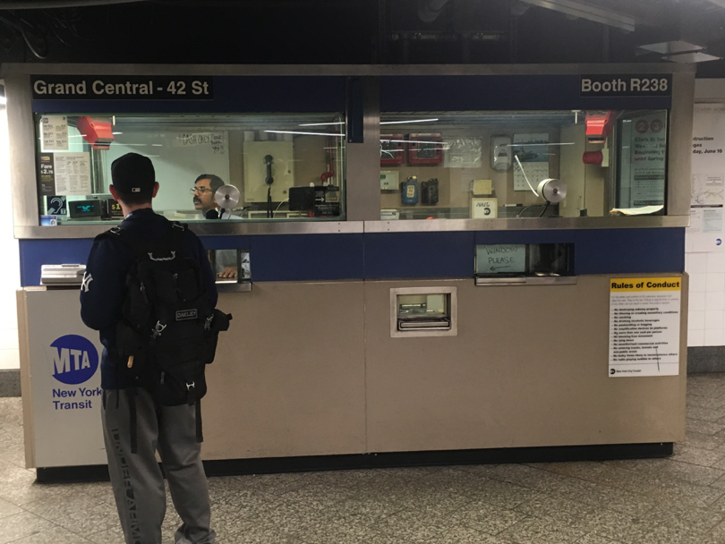
Pictures by Kevin Connor.
In the upper right corner of the booth, you can see a number, which is the control area number for this collection of turnstiles.
I determined that the minimum unique identifier for each turnstile was the combination of the RA ID and the CA.
I grouped by station and CA in order to link the entry and exit points with the station they are part of.
To do:
Add picture of plots.
Add the narrative from the presentation.